I have a big update for JMetro this time. Version 3.8 brings the following new Fluent Design (FDS) inspired styles (dark and light) and updates:
- New Radio Button style;
- New style for Check Box;
- New style for Menus;
- Updated style for Context Menu;
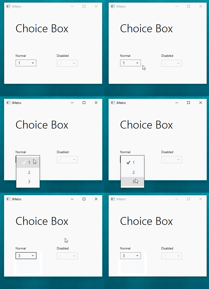
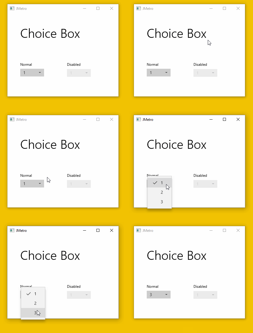
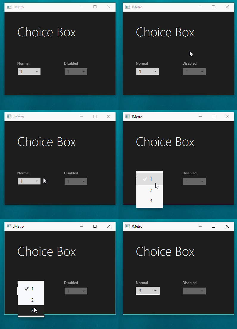
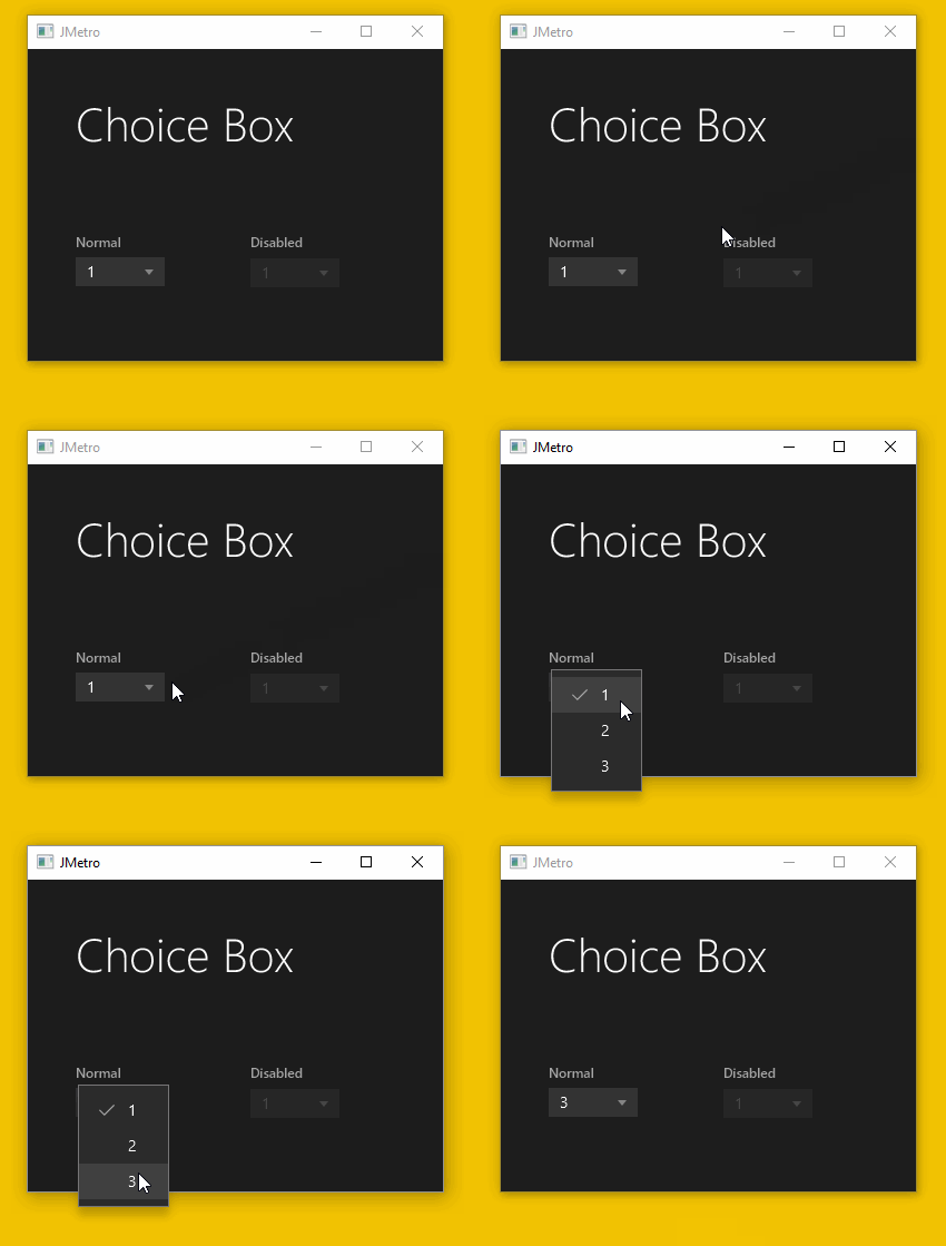
- New style for Choice Box.
JMetro new version details
I decided to, for now, switch focus off on the JMetro samples. I still styled the controls to look good and have a distinct appearance when they are focused, though. I’ve done this because the focus ring functions a bit different in Windows 10 than it does, by default, in JavaFX applications.
In JavaFX applications the control gets focus (gets added the focused pseudo class) whenever you mouse press it, whereas in Windows you need to first press the Tab key or arrow keys (in some situations) to activate the focus system, making the focus ring appear, and then cycle through until you get to the control you want.
This makes sense since, with this, the focus ring is only shown when the user does indeed want to interact with the application through the use of the keyboard and thus it avoids this distraction, otherwise.
You can still have this behavior in JavaFX, you just need to code it. I don’t know yet how new versions of Mac OS work in this regard (I don’t have a recent Mac to test this), but it could be a feature to add to JMetro, in the future.
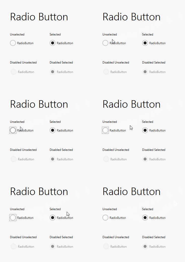
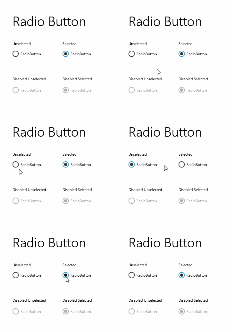
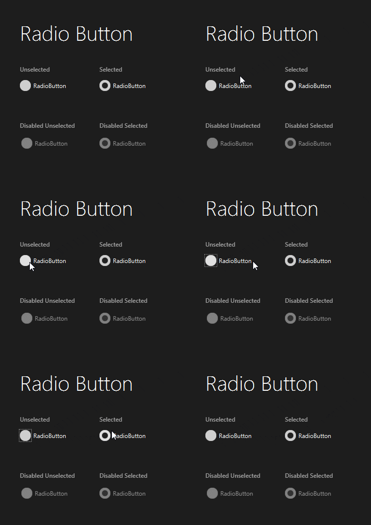
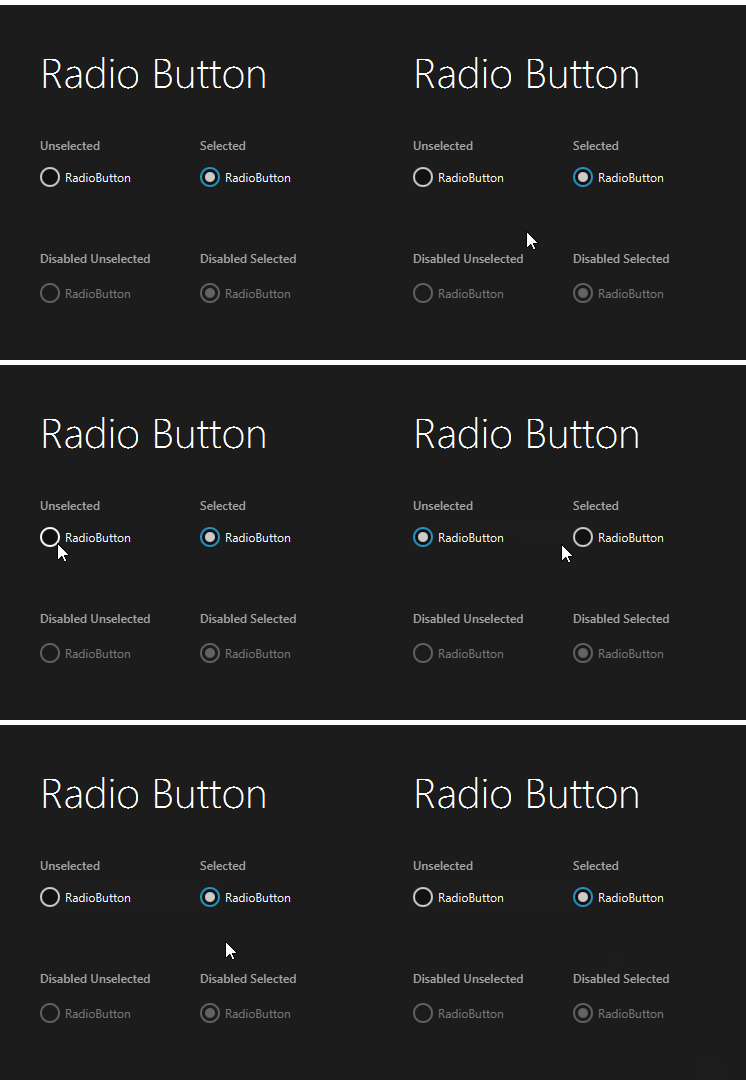
Radio Button new style
The following animations show the new style and old style of the Radio Button:
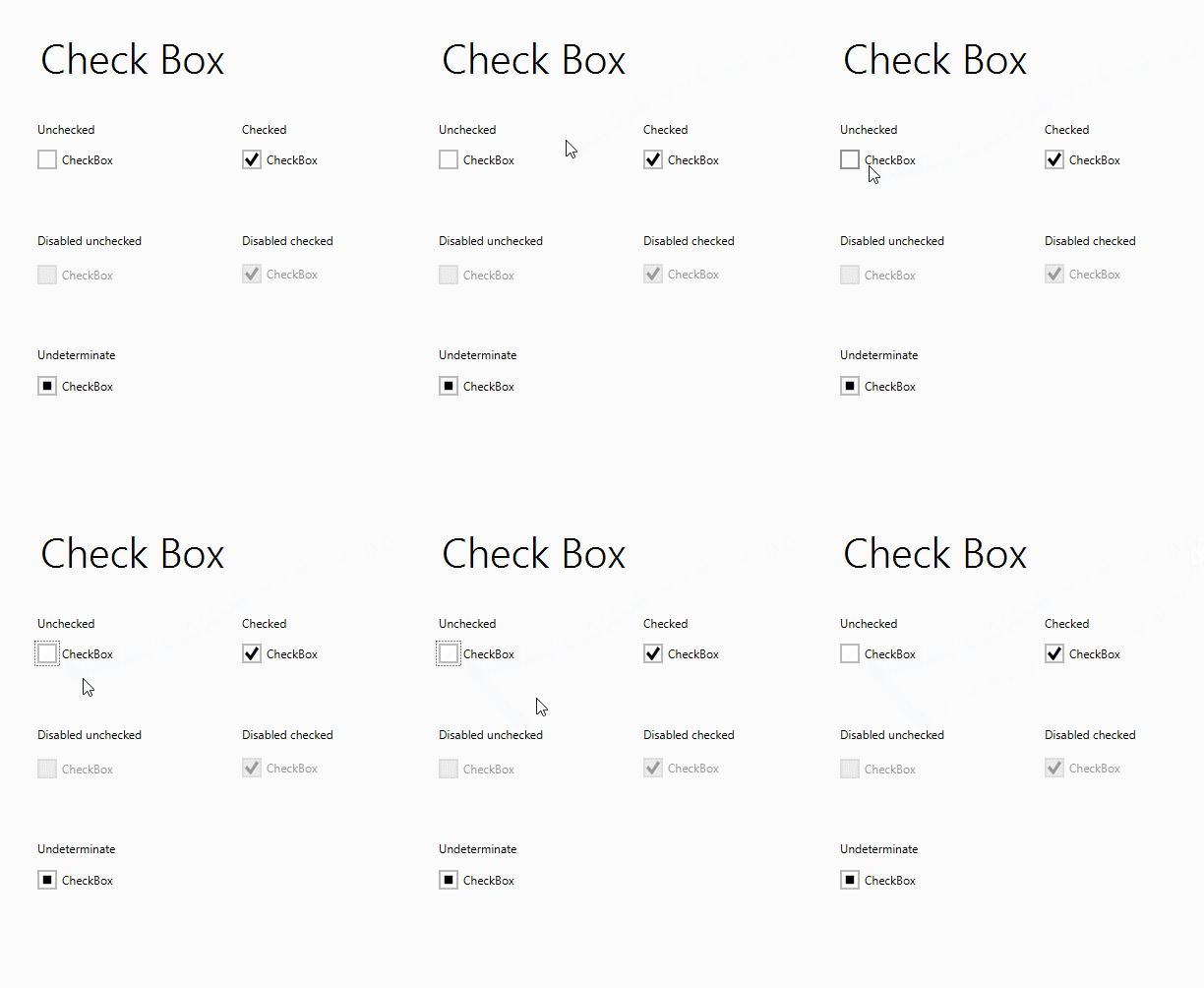
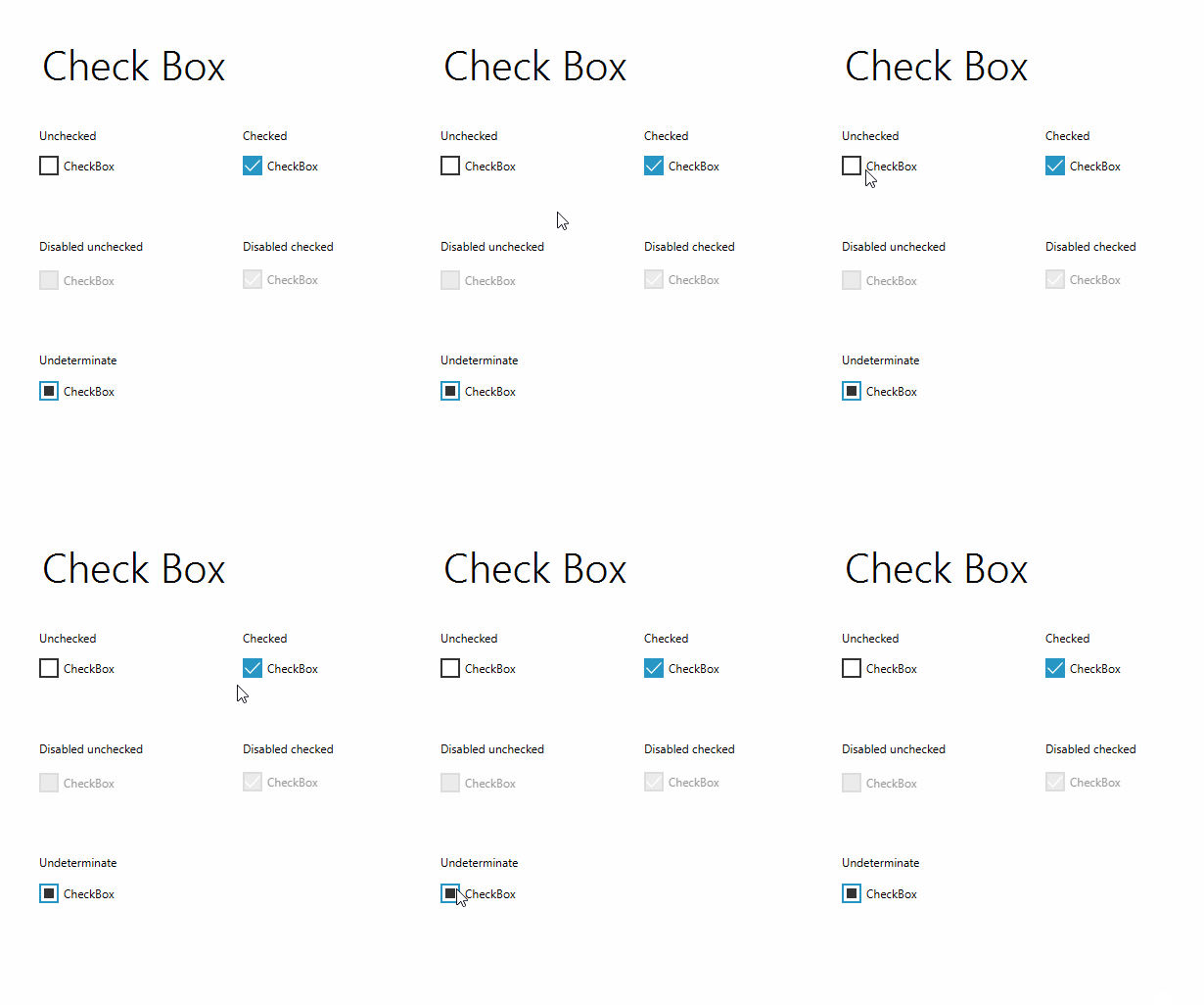
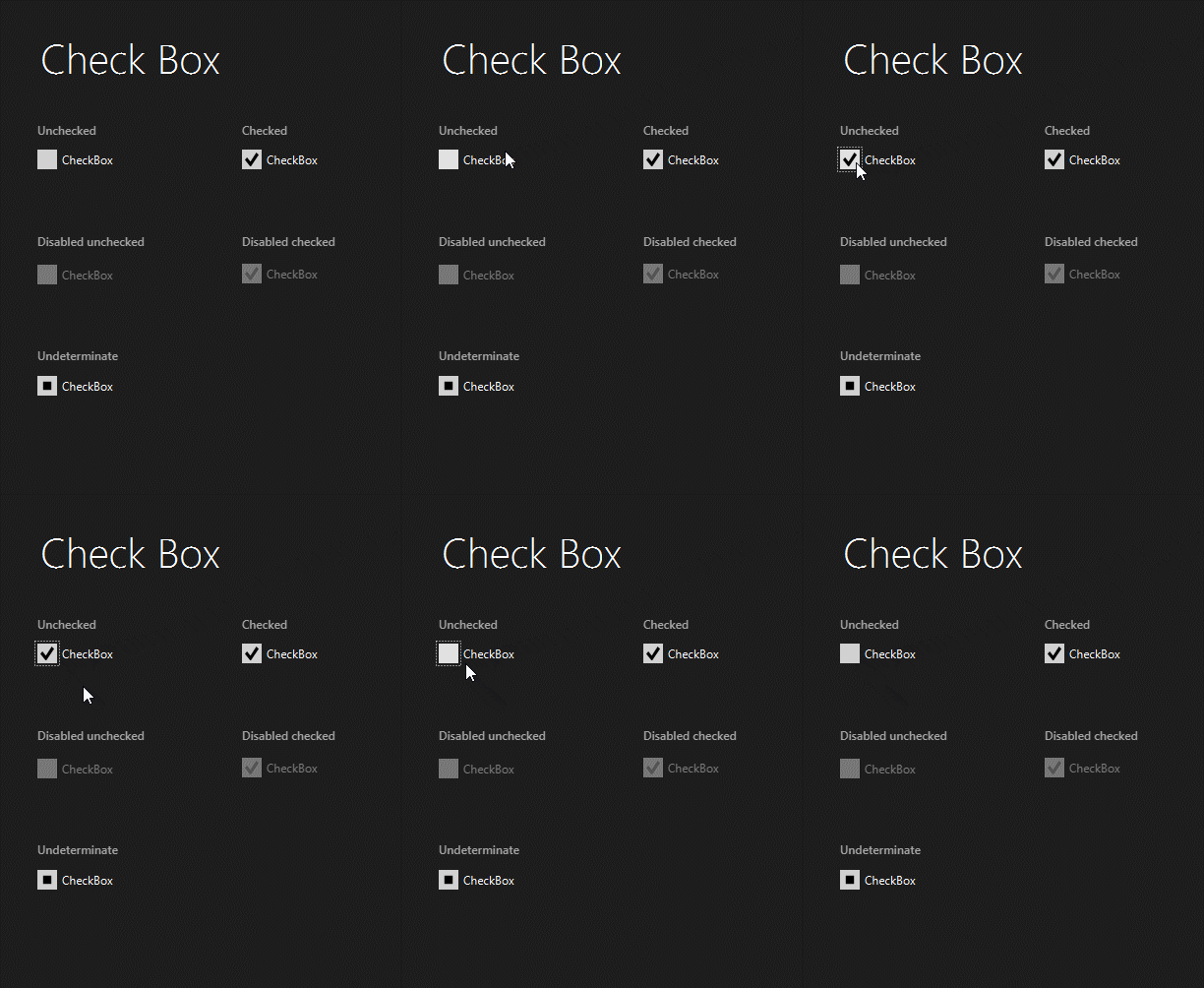
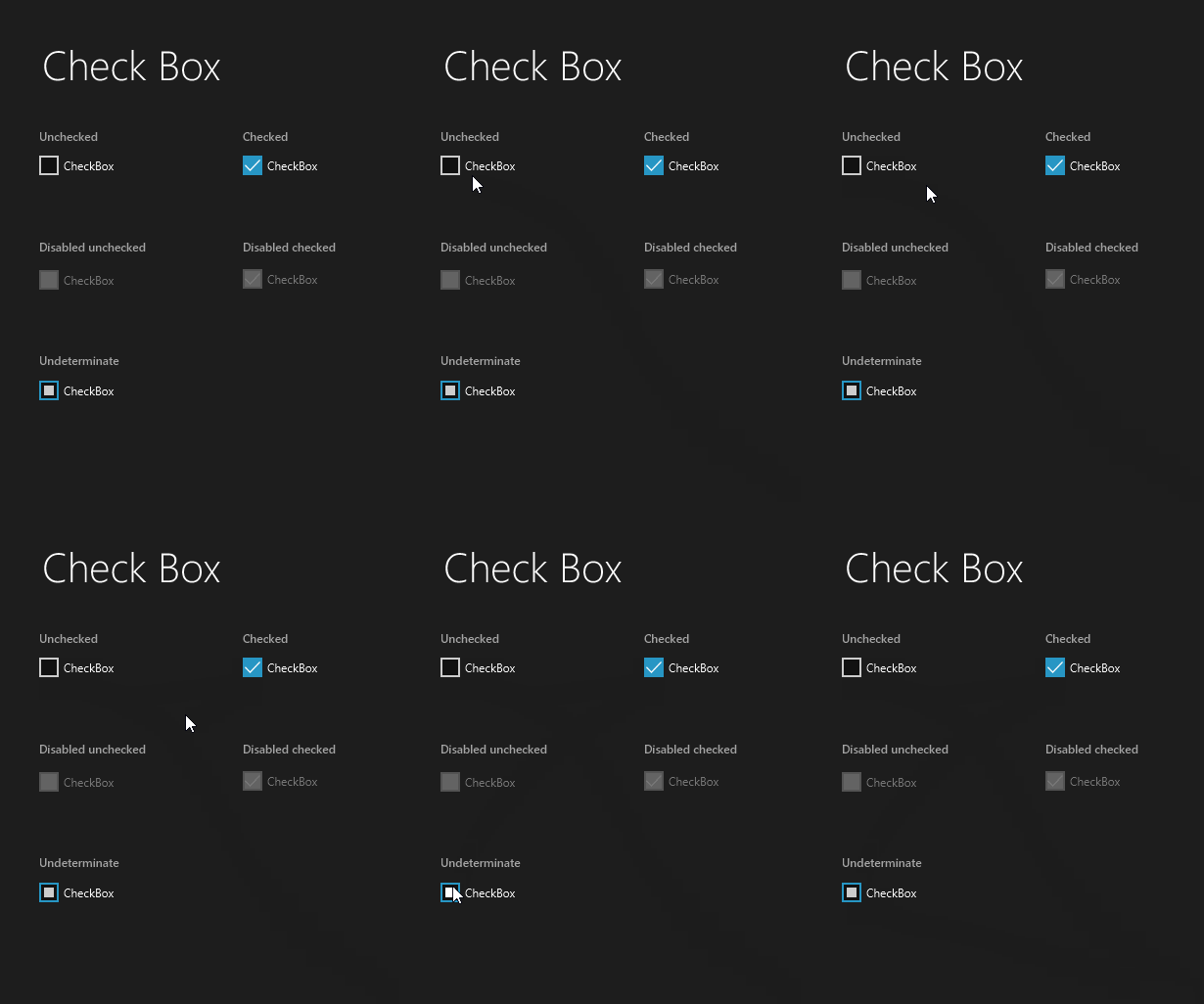
Check Box new style
The Check Box has seen a significant change:
Since I changed the Check Box, for consistency sake, I also needed to change every other control that used a check mark before delivering a new version. These controls are the Choice Box and Menu.
New Choice Box style
As I mentioned before this is not a control that exists in the Fluent Design specification. It only exists in JMetro.
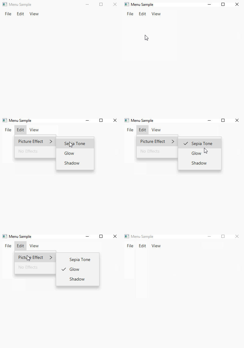
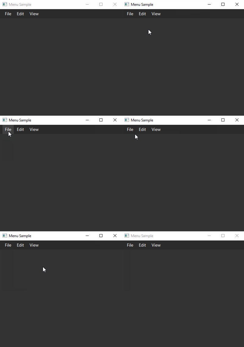
New Menu style
This style is a new addition. It’s another one that only exists in JMetro. It doesn’t exist in the Fluent Design System specification, at least not yet.
This style comprises the Menu Bar and the Menu Items that show up when the Menu Bar is open, which themselves can be Menu Items of type “Check Box Menu Item” or “Radio Menu Item” (there can only be one RadioMenuItem selected in the same ToggleGroup).
In the sample below the “Picture Effect” sub-menu contains MenuItems of type RadioMenuItem, all belonging to the same ToggleGroup, and the “View” menu contains MenuItems of type CheckMenuItem which work pretty much like a CheckBox.
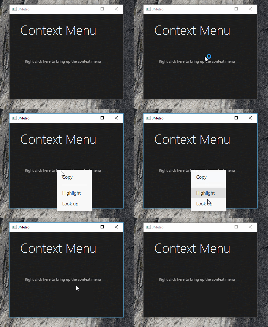
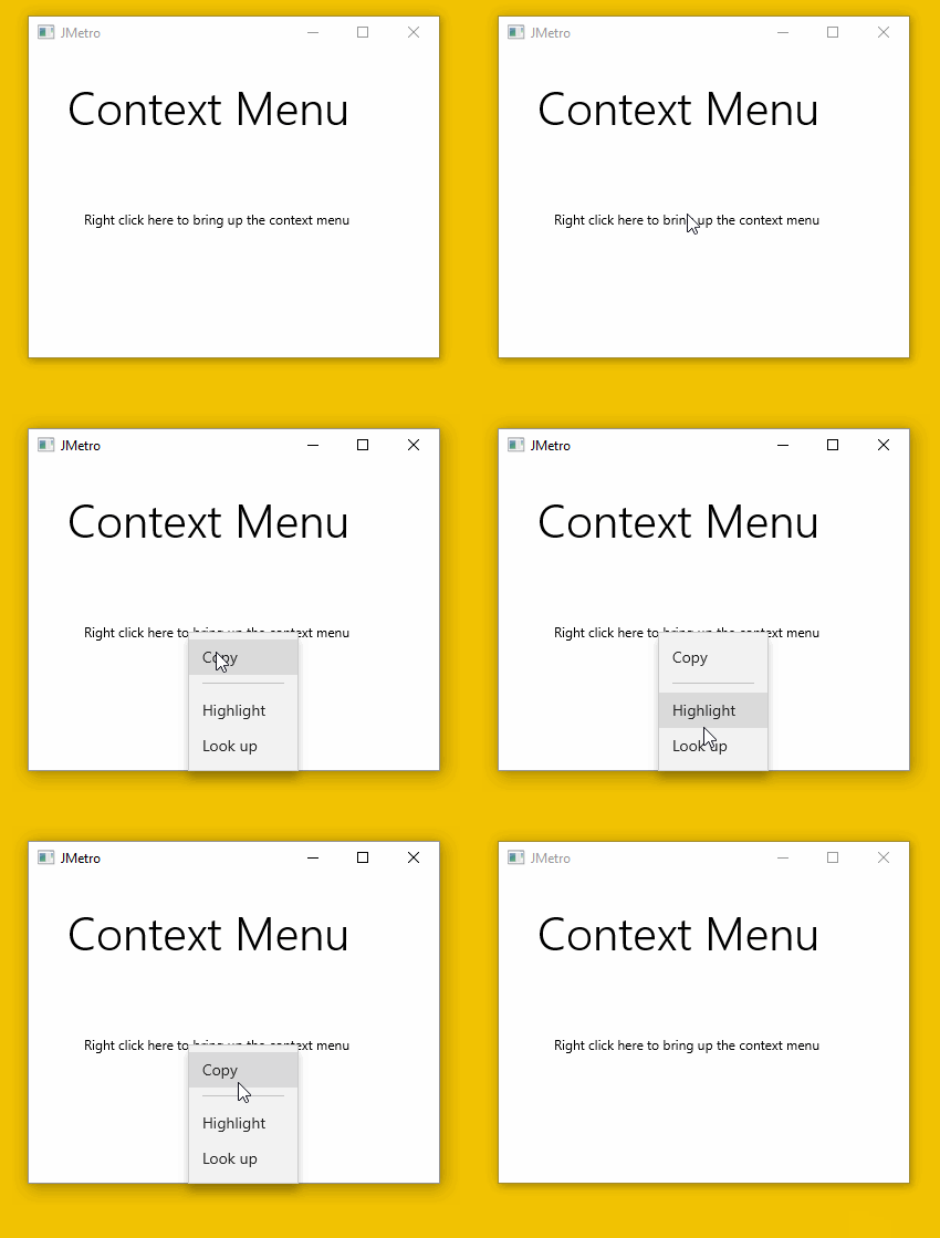
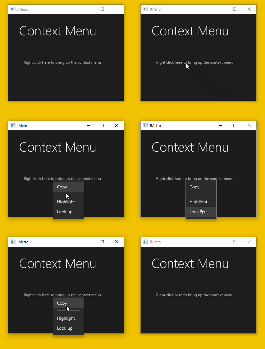
New Context Menu style
The Menu and Context Menu are interlinked. Both use MenuItems for their content. So while creating the new Menu style, I toke the opportunity to also update the Context Menu style yet again.
I changed the pressed and hover styles and also made the MenuItems even more compact, by reducing their height. In previous versions of JMetro my intention was to have the touch targets big enough so the application could be used without change both in touch devices and mouse based devices (desktop and laptop).
This proved to not be the best strategy as users of mouse based devices ended up with applications that were not optimized for their system, with controls that occupied too much space and wasted screen real estate. This is especially important in productivity applications.
For these reasons JMetro is now optimized for mouse based systems with controls occupying just the space they need to occupy. Whenever application developers need to distribute their applications in touch based devices (phones, tablets, etc), they’ll need to just reconfigure the height through the CSS of each control (only the ones that need it) to be enough to conform with touch target sizes. This way they’ll get an application that is optimized for both touch based devices and mouse based devices with just a little bit more programming effort.
I may in the future add a “touch” style class that developers can easily toggle to switch controls to being touch based optimized or “mouse” optimized.
The following are animations of the new and old Context Menu style (before version 3). The old style only had one version:
And here are the new styles in this JMetro version:
Wrapping Up
This was a big update to JMetro, which added 5 styles in total, including dark and light versions. New styles have been added to: Radio Button, Check Box, Choice Box, Menu and Context Menu.
JMetro has now styles for almost all JavaFX controls that ship with the SDK. It also adds new styles and new controls that don’t exist by default.
The new versions focus on optimizing screen real estate for each platform. More compact in mouse based devices (laptops, desktops) and bigger controls in touch based devices. Developers still need to configure each control’s CSS (those that need it), but that may be even easier in future versions.
I still haven’t updated the documentation, I’ll be doing that in the upcoming days.
As always if you want to stay up-to-date and don’t miss out, subscribe to this blog and follow me on twitter.
Here’s what I have planned next:
- New style for Toggle Switch;
- New style for Slider;
- New style (including new animations) for Button;
- Easily specify colors of controls;
- Etc.
Hi your controls look nice, but the documentation is a nightmare!!! I m soory to say that, but i already messing around for 2 hours to figure out which version have the new styles. Completely confusing.
Hi Adrian,
That’s OK. One thing you need to understand first though, this is a project that I’m doing in my spare time and handing out for free, you can’t expect top notch documentation and support in something that’s given out for free. In that situation there’s some degree of effort that users are expected to do (unless they want to sponsor the project).
Another thing is that JMetro is continuously evolving so having a documentation page with all the controls in their current state would be a complete time drainer. My spare time is limited so wasting it to produce top notch hassle free documentation instead of actually evolving JMetro would be a waste of time, in my opinion.
I’m open to suggestions though..
One thing you can do, is run the themetester app in the samples sub-project and check out for yourself all the current controls styles live. Perhaps that’s not clear enough in the documentation?
Thanks,