

Introduction
[Warning: this documentation might be slightly out-of-date. Check the code repository, check the samples sub-project. New Skins and features might already have been added that are not present in this documentation page]
A collection of new Skins for existing JavaFX controls. These Skins will add more functionality to the controls used in your applications with practically zero need to make changes to your application’s code.
This is a Java / JavaFX library targeted for Java 11 and above up until the most recent Java version (but should also work with Java 9 and 10). It is currently being built and tested using the current LTS Java version which is Java 11.
Project Description
Contents
FXSkins provides a collection of new Skins for existing JavaFX controls. Theses Skins can be easily added and removed through a minimal API that FXSkins provides. They can also be easily added to already existing applications with almost no changes to the code.
FXSkins leverages JavaFX Skin’s API. The existing controls API that you use remains the same so there is very little coupling between your application and FXSkins.
All FXSkins Skins will, by default, have the Modena look. All enhancements were made so that everything looks nicely on a default Modena styled application. However, like with default JavaFX controls Skins, you can always style these new skins through CSS.
Finally, you don’t need to add all the Skins in FXSkins, you can decide which ones to use and, for instance, for the rest, use the default JavaFX Skins.
Personally, I think Modena feels outdated (plain Modena without any re-styling) and that’s just natural since it was created in 2013. So most examples in this page are going to be shown with the JMetro theme applied. But, as mentioned, you don’t need to use JMetro, FXSkins default style is meant to look in harmony with Modena.
Check the “FXSkins-samples” sub-project inside the repository if you want to see small sample apps showcasing how to apply FXSkins.
How to use
All you need to do to start using FXSkins is call FXSkins.getStylesheetURL() and add the returned stylesheet to a Scene or Parent.
scene.getStylesheets().add(FXSkins.getStylesheetURL());
The rules specified on FXSkins may override the rules on your application. If that’s not what you want, make sure to check out the FXSkins stylesheet and then follow CSS specificity and JavaFX CSS documentation.
How to get it
This library is available on Maven Central or you can download the jar directly from GitHub: https://github.com/dukke/FXSkins/releases
implementation 'com.pixelduke:FXSkins:1.0.0'
To use FXSkins consult the section “How to use”.
For your reference you can check out FXSkins stylesheets that are available in the FXSkins repository. This exist, to style the features that FXSkins adds with a style that works in harmony with Modena. The files are inside the FXSkins project (FXSkins directory).
Samples (code examples) can be found inside the samples project (FXSkins-samples folder).
Some controls with new skins in FXSkins can be found in the ControlsFX library.
If you’re using FXSkins please send me pictures of your app to  . If you can, ideally, please also share it through social media (Twitter) and let me know (you can reference me through my twitter handle @P_Duke and you can also use the #FXSkins tag). It will be very important to check how you are using FXSkins and adjust it to better fit the use cases. Also for showcasing example uses (if you allow).
It is also important for me, and to keep me motivated to continue, to know that FXSkins is being used and how it is being used.
Given all these unpaid work is given out for free, I just ask you to share it is being used and how if you can. ?
License
FXSkins license is “GNU General Public License, version 2, with the Classpath Exception’“
Request for feedback
If you’re using FXSkins please send me pictures of your app to . If you can, ideally, please also share it through social media (Twitter) and let me know (you can reference me through my twitter handle @P_Duke and you can also use the #FXSkins tag). It will be very important to check how you are using FXSkins and adjust it to better fit the use cases. Also for showcasing example uses (if you allow).
It is also important for me, and to keep me motivated to continue, to know that FXSkins is being used and how it is being used.
Given all these unpaid work is given out for free, I just ask you to share it is being used and how if you can. ?
Contributing
Contributions via Pull Requests (PR) are welcome! Help grow this library if you like it! Before filling a PR please create an issue in the issue tracker.
Skins
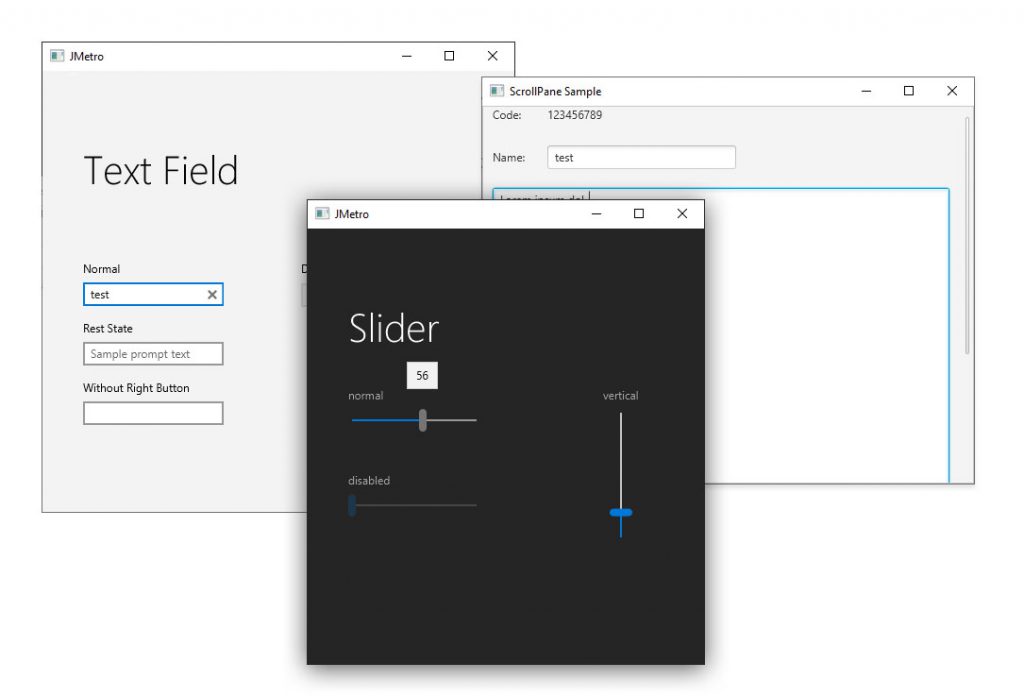
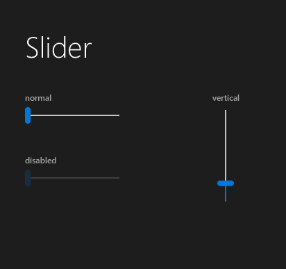
Slider Skin
The Slider Skin shows a popup showing the exact value “chosen” through the slider. It also adds a fill to the slider itself, from the beginning of the popup till the position of the thumb.
CSS Properties
| CSS Property | Values | Default | Description |
| -show-value-on-interaction | Boolean | true | Defines whether to show the value popup |
Other CSS Styling
Example of styling the Slider fill.
.slider .fill {
    -fx-background-color: -fx-accent;
    -fx-background-insets: 1;
    -fx-background-radius: 0.25em; /* 3 */
}
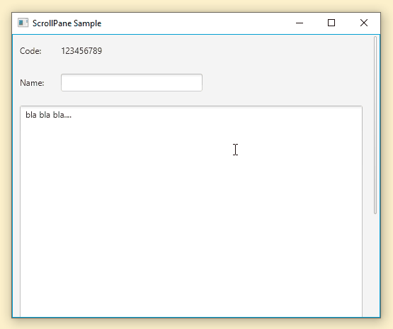
Conscious ScrollPane Skin
The Conscious ScrollPane by default displays a minimal look, with only the thumb showing, overlaid over the content. This provides a UI that is less cluttered when compared with UIs using the default JavaFX ScrollPane Skin. Whenever the user wants to directly interact with the ScrollBars (by moving the mouse hover the ScrollBar area) the ScrollBars will change their appearance to show their full UI.
More Details
The ScrollBars are overlaid over the content. If you don’t want the ScrollBars to overlay the content, add some right or/and bottom padding to your content.
Conscious ScrollPane Skin needs to use private API from javafx.controls module (because standard JavaFX Skin’s code is still a bit too closed) so in order to use it you need to open this module to com.pixelduke.fxskins.
Here’s how you can add those flags through gradle:
application {
    applicationDefaultJvmArgs =  [
            "--add-opens=javafx.controls/javafx.scene.control.skin=com.pixelduke.fxskins"
    ]
}
Other CSS Styling
There are two ScrollBars and you can target the style of each one through CSS.
Targeting the “minimal” Scrollbar:
.scroll-pane > .minimal-scroll-bar {
   /* ..CSS style */
}
Targeting the “normal” Scrollbar:
.scroll-pane > .normal-scroll-bar {
   /* … CSS style */
}
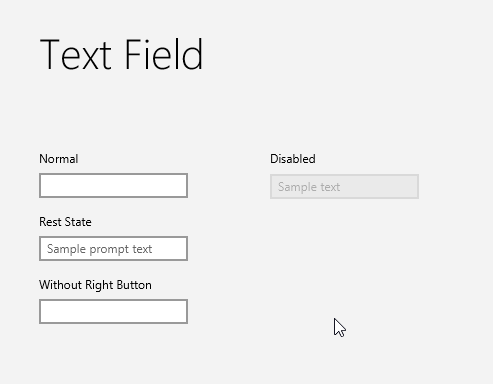
TextField Skin
The TextField Skin adds a clear button to the right of the TextField.
Below you can see an animation of a TextField using FXSkins TextField Skin and using the JMetro theme.
CSS Properties
| CSS Property | Values | Default | Description |
| -right-button-visible | Boolean | true | Defines whether to show the right clear button |
Other CSS Styling
Below is an example of targeting the style of the “right button”. You can define any SVG shape (using SVG Path notation) in the -fx-shape property.
TextField > .right-button > .right-button-graphic {
    -fx-shape: "M221.738,305.873l6.135,6.16l-2.875,2.863l-6.135-6.159l-6.263,6.237l-2.864-2.875l6.263-6.238l-6.177-6.202l2.875-2.863l6.177,6.201l6.244-6.22l2.864,2.876L221.738,305.873z";

    -fx-padding: 0.416667em;
    -fx-background-color: #333;
}
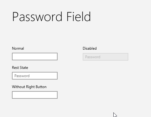
PasswordField Skin
The Passworld Skin adds a “view” button to the right of the PasswordField. That view button allows you to see the password you entered.
Below you can see an animation of a PasswordField using FXSkins PasswordField Skin and using the JMetro theme.
CSS Properties
| CSS Property | Values | Default | Description |
| -right-button-visible | Boolean | true | Defines whether to show the right “view password” button |
Other CSS Styling
The way you style the “right button” (view password button in the case of PasswordField) is the same as the way you do it for the TextField Skin. Check TextField Skin CSS styling description.
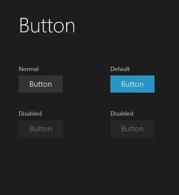
Button and ToggleButton Skin
The Button as well as the ToggleButton Skin, which is similar, adds a shrink animation effect to the Buttons (and ToggleButtons).
CSS Properties
| CSS Property | Values | Default | Description |
| -shrink-animate-on-press | Boolean | true | Whether the button should do a shrink animation when pressed |
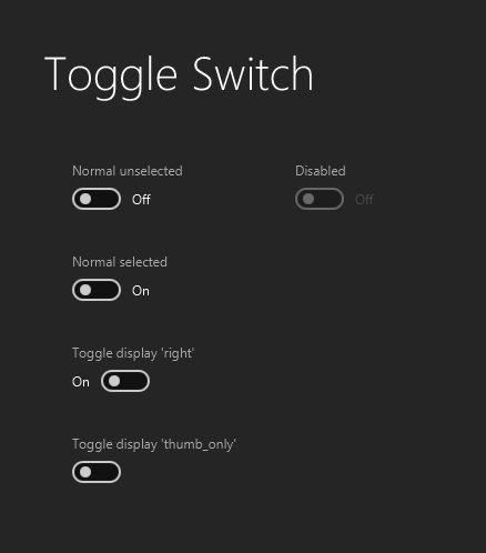
ToggleSwith Skin
The ToggleSwitch Skin adds 3 different ways to layout the “Toggle” and its accompanying label. Layout label to the left, to the right or no label (show just the toggle).
CSS Properties
| CSS Property | Values | Default | Description |
| -toggle-display | [ left | right | thumb_only] | left | How to layout the label and the toggle |
| -thumb-move-animation-time | double | 200 | The time it takes to animate the thumb after the user clicks to select or deselect |
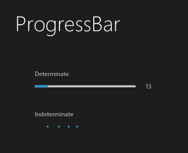
Points ProgressBar Skin
The points ProgressBar Skin changes the look of the ProgressBar when infinite progress is set.
Each point is styleable via CSS.
The animation runs smoother than the screen capture shown below.
Other CSS Styling
There are 5 dots. You can style each one individually.
.progress-bar:indeterminate .dot_1 {
    -fx-background-color: -fx-accent;
}

.progress-bar:indeterminate .dot_2 {
    -fx-background-color: derive(-fx-accent, -15%);
}

.progress-bar:indeterminate .dot_3 {
    -fx-background-color: derive(-fx-accent, -30%);
}

.progress-bar:indeterminate .dot_4 {
    -fx-background-color: derive(-fx-accent, -45%);
}

.progress-bar:indeterminate .dot_5 {
    -fx-background-color: derive(-fx-accent, -60%);
}
You can also target all dots at once, all of them have the same dot style class.