Here we are again with another version of JMetro.
New additions in this version:
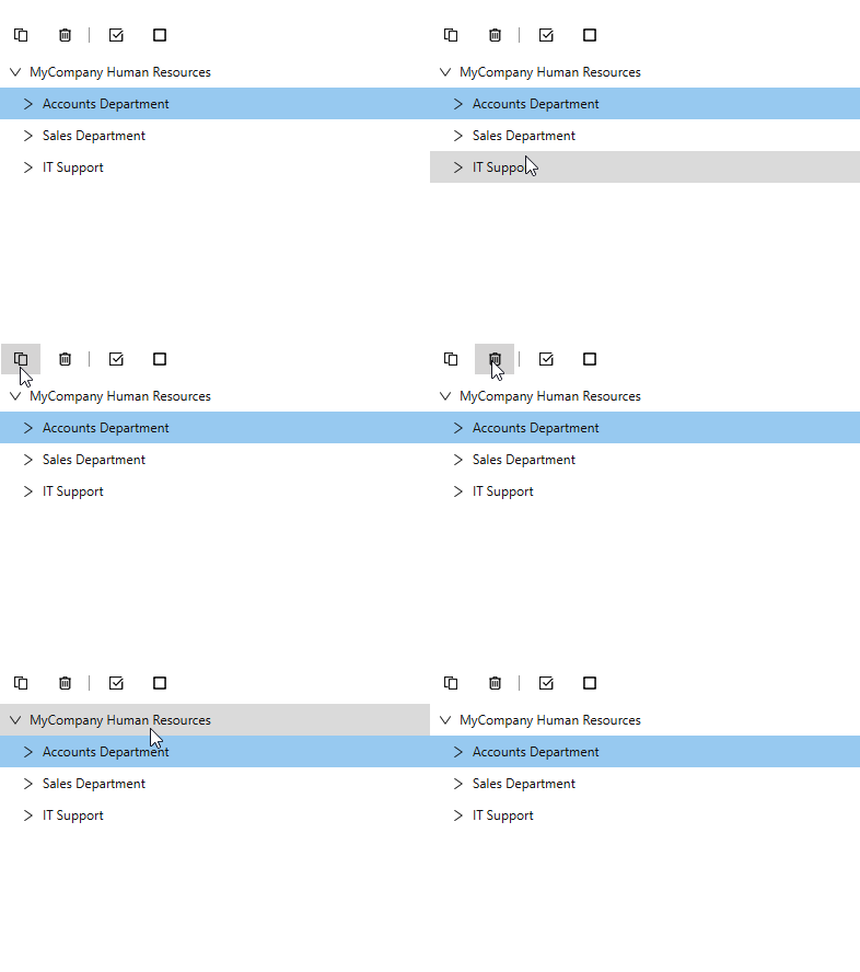
- New style for controls inside Toolbar
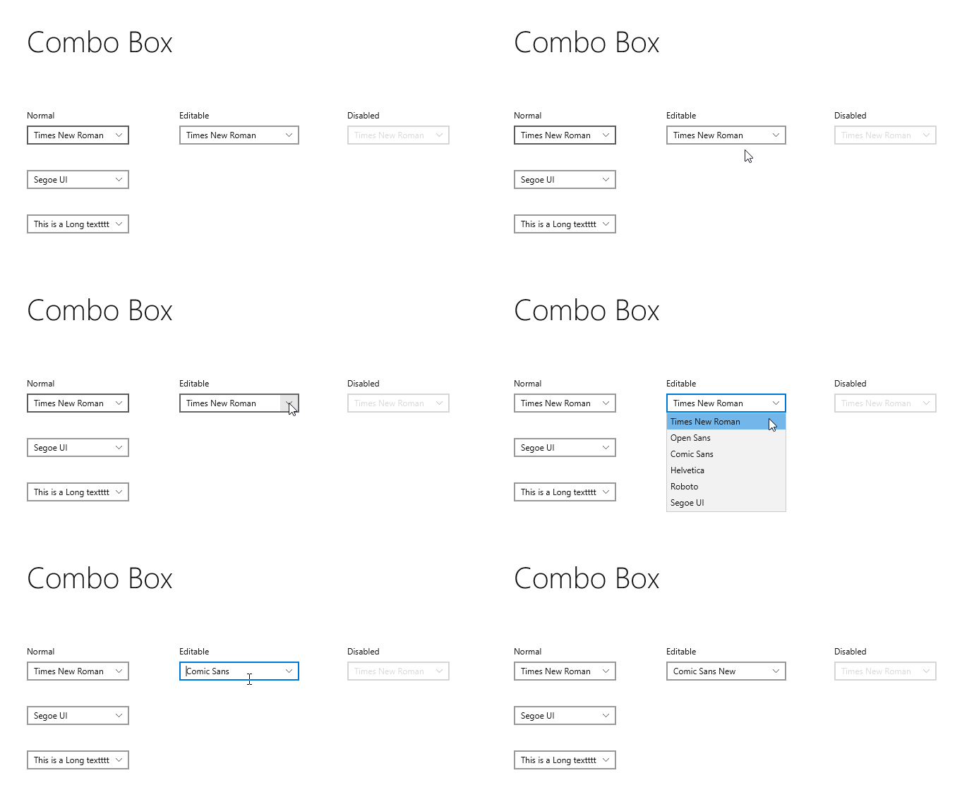
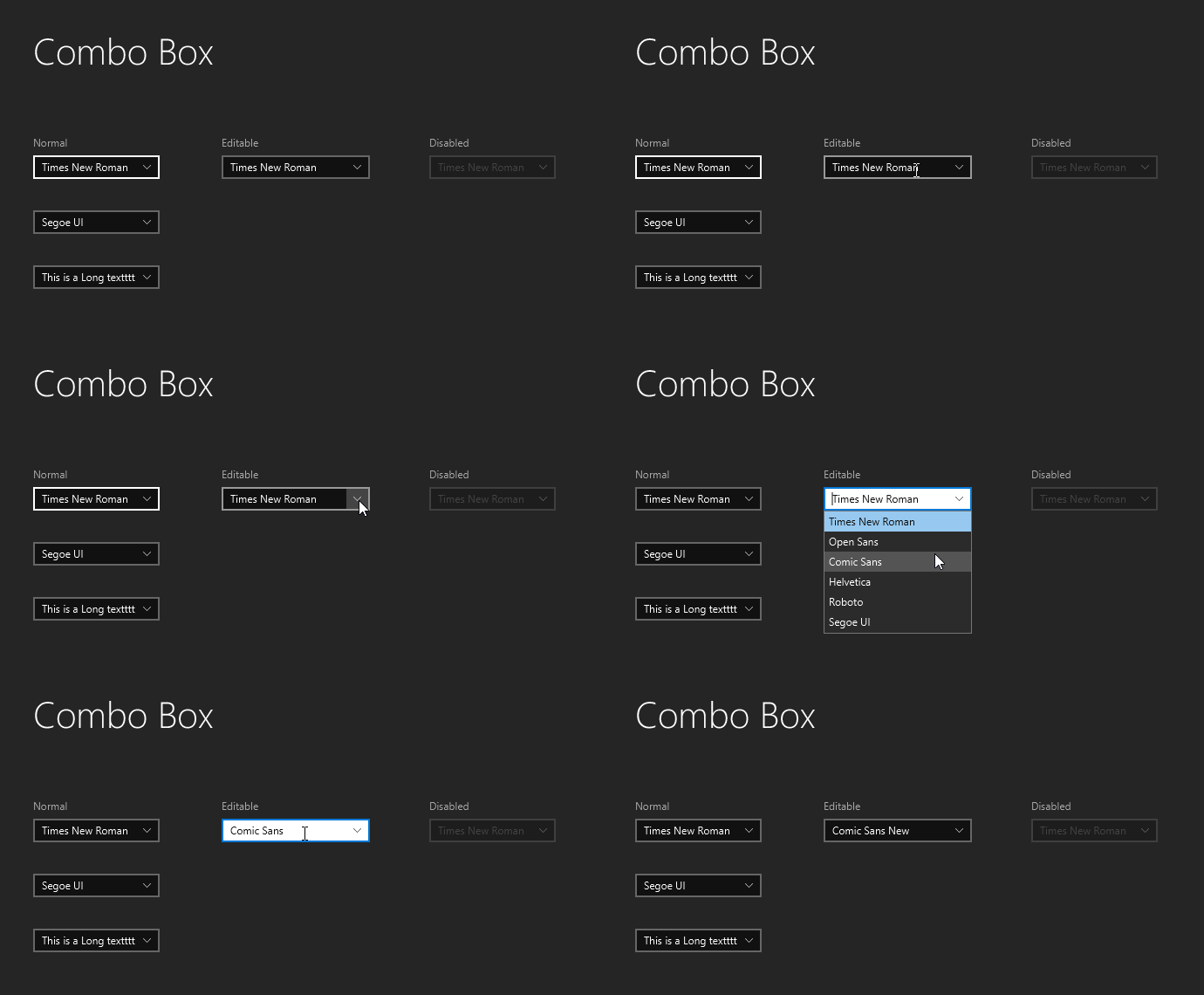
- New editable ComboBox style
- Some tweaks to other styles
- Some fixes
Keep on reading for details.
Editable ComboBox New Style
The editable ComboBox of previous versions of JMetro looked quite bad, mostly because, well, they didn’t actually have a defined style. Below you can see the editable combobox in Modena and JMetro Dark and Light style.


I’ve also put the default JavaFX Modena style just for comparison sake. So you could see the differences to the original.
Toolbar Buttons New Style
This is actually a new style for Buttons and ToggleButtons that happens to be on, by default, when they are inside a ToolBar. You can set this style on a Button or ToggleButton by adding the styleclass light to them in case they’re not inside a ToolBar.
Below I show an animation containing a JavaFX Scene where at the top there is a ToolBar, and below it, a TreeView.
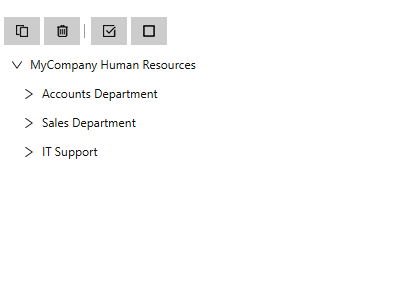
The second image shows the same JavaFX Scene but on previous JMetro versions, without this new style for ToolBars. The icons are from icons8.


The purpose is mainly for them not to be as prominent as regular buttons are, making a toolbar (or another place where you decide to put them) seem “less busy”.
This is yet another adaptation as, to my knowledge, Fluent Design doesn’t define a style for ToolBars. It does have a similar concept (or specialization) called an App Bar.
Other Changes
Other changes include:
- DatePicker: open calendar twice causes exception
- Add some margin around Separator control
- Add more space to the inside right part of a ComboBox so that more text fits inside
- Convert some of the content of stylesheets from px to em
- TreeTableView: Show/hide columns button should be the same as TableView
That’s all for now, check out my twitter account if you want to stay updated. From now on, my intention is to post more updates there.
Have a nice week! 🙂