This time something different.
I’ve just updated this site design. I wanted it to look a bit more than a blog site as well as improve the overall appearance. To this effect, I added a front page, a new page layout with 2 columns that replaces the old layout on some pages and tweaked the site’s color scheme. Finally, I also did some small tweaks here and there.
A bit of history
I’ve started blogging 11 years ago on 2010 about JavaFX and that’s also when I’ve ventured into FOSS (Free Open Source Software).
Back then my first FOSS project was a component called JXScene that allowed to embed a JavaFX scene in a Swing application which wasn’t officially possible at that time (not provided by the JavaFX SDK): Embedding JavaFX component and debugging
I later contributed that component to JFxtras, which was the first free open source JavaFX library containing a collection of JavaFX components contributed by several developers (like ControlsFX).
This blog was started on the WordPress site. The WordPress site allows you to create a blog, with limited functionality, under the WordPress domain.
Later I wanted to have more control over the site so I decided to host the blog myself. To that effect the easiest and quickest solution was to host my own version of WordPress, that way I could easily migrate all my old blog posts to the “new site”.
Current day
From the first self hosted version of this site up until now, I’ve always been tweaking the design of the site. Unfortunately the free time to do it has been limited and so I’ve always been dissatisfied with the site.
There’s still a lot of things I would like to tweak now, but I’ll leave it for a later time in the future when I have some more free time.
This site is built using WordPress. This means that when I want to tweak the design I need to work with PHP, CSS, HTML, Javascript and the WordPress API.
The theme is custom maid, it’s not one that was already built and available. All this site was designed and implemented manually using the technologies and frameworks I mentioned.
New Redesign
Color Scheme
The color scheme has been simplified and the number of colors have been reduced. I’m now only using shades of yellow and orange, along with white, grays and blacks.
Redesign of Pages
For this redesign a few pages have been tweaked from a 3 column layout to a 2 column layout.
I’ll start by showing the change in the Blog post page.
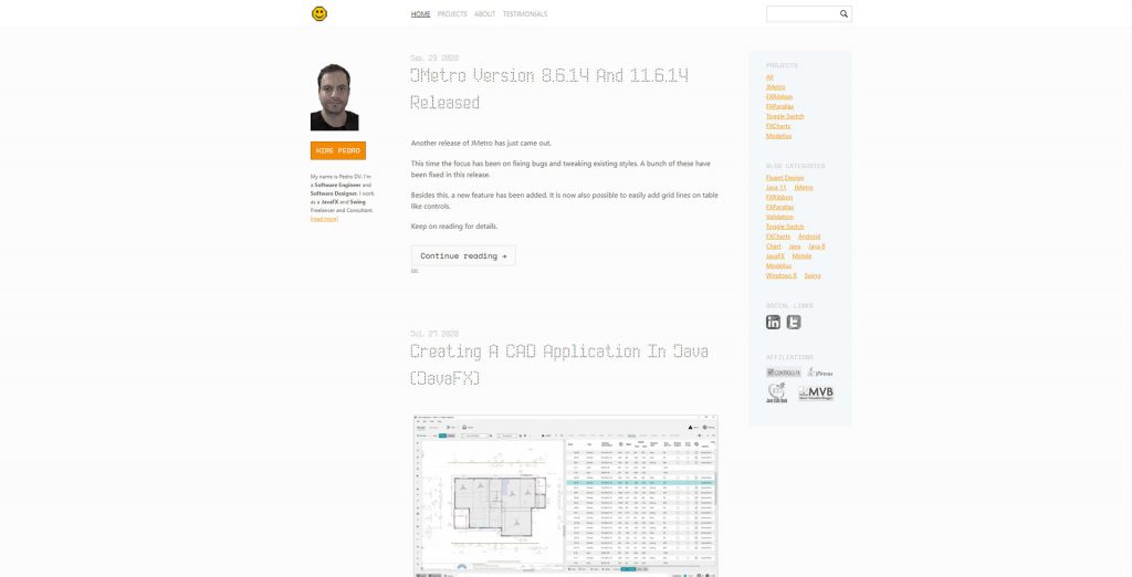
Old Blog page 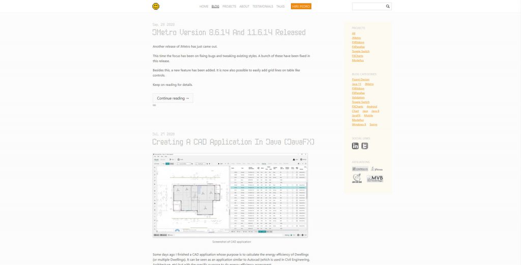
New Blog page
New Testimonials page redesign.
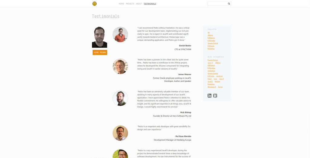
Old Testimonials page 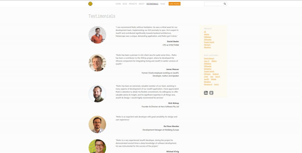
New Testimonials page
New Contact page redesign.
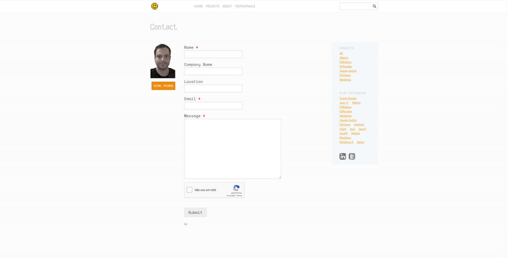
Old Contact page 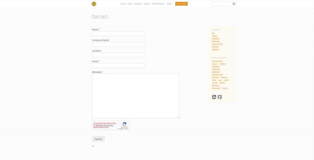
New Contact page
Finally, also search, and category view pages have been changed to a 2 column layout.
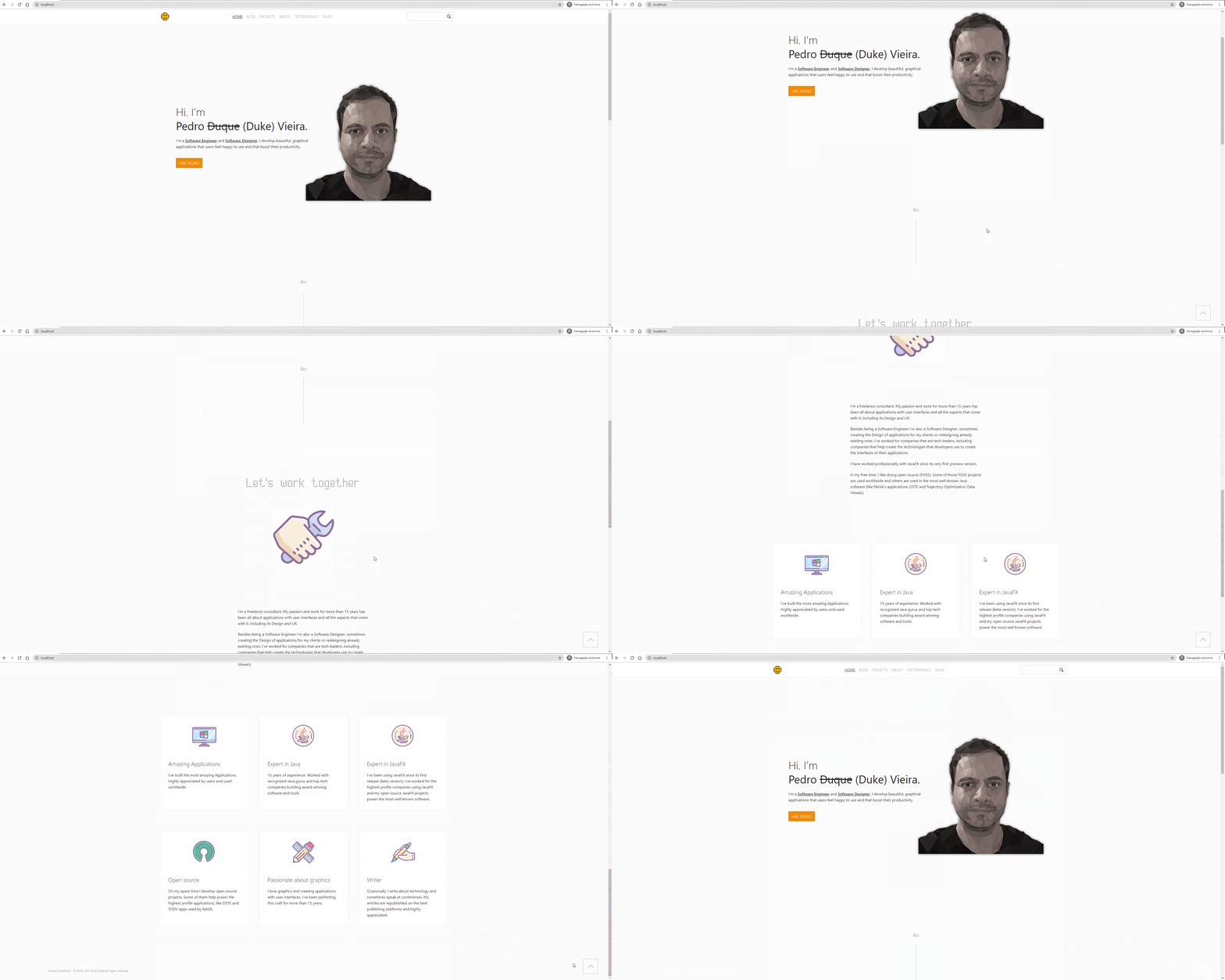
New Front Page
A new front page has been added, now showing up initially instead of the blog page (which was the old front page). This serves as an introduction page to me and my work.
Making it all responsive
A headache of modern site design, which will also happen if you’re creating an app that’s supposed to run on the various form factors (desktop, tablet, mobile) with roughly the same code base, is making it all work across the different screen sizes.
Although the main target for this site are desktop users which is the main medium on which users visit this site I still want to also make it an OK experience for users visiting this site from mobile/tablet (which still accounts for almost 20% of this site’s users). So I always need to make things responsive every time I redesign this website.
This means layout and design changes to make the content clearly visible and readable across different device screen sizes.
Checking on Google Analytics I can see that there’s a whooping number of different screen resolutions from users visiting this site. The total is 822 different screen resolutions, that range from really small (around 200 pixels wide) to really big resolutions (bigger than 4k).
This number is even much bigger when you consider the fact that not all users see the browser in full screen.
Other design tweaks
Other design tweaks have also been made here and there.