Metro style Slider for java (JMetro)

One thing that’s missing from java 8 javafx slider is the fill that comes from the beginning of the slider to the thumb. You can see this in windows 8 as well as several other operating systems: ios 6 and 7, android, etc.

So by using only CSS, it is not possible to style the fill of the slider, to accomplish this you’d have to create your own skin to use with the slider. And that’s exactly what I did by creating the “FilledSliderSkin”.

With this skin set on the slider you can style its fill color, like so:

.slider .fill {
 -fx-background-color: #00828b;
 -fx-padding: 0.333333em; 
}
.slider .fill:hover {
 -fx-background-color: #219297;
}

You can use this skin to achieve the styles of ios 6, 7 and android sliders.

And here are the screenshots of the slider with a metro style:

Slider - Dark Theme

Slider – Dark Theme

Slider - Light Theme

Slider – Light Theme

Metro style ProgressBar for java (JMetro)

It’s been a while since my last post..

I’ve been doing some tweaks here and there but nothing too significant for a blog post. Unfortunately haven’t had much time to spend on side projects, hopefully I’ll have time to style a new control every other week or so..

So, this time it’s the ProgressBar (also some other tweaks to the existing styles). Enjoy!

ProgressBar (dark theme)

ProgressBar – Dark Theme

ProgressBar (light theme)

ProgressBar – Light Theme


Metro style Password Box for java (JMetro)

The metro style password field is very similar to the Text Box (Text Input Field) in its design. The look is very similar and it also has a button to the far right of the control.

passwordBoxWindows8

Password Box with the password masked


This time instead of clearing the field, pressing the button will reveal the text you’ve just entered which is by default masked. This is useful, especially for long passwords and while entering the password through touch instead of a keyboard, which is less error prone.

passwordBoxWindows8-buttonPressed

Password Box with the password revealed


So here are the screenshots of the light and dark theme of the Password Box JMetro skin implementation:

Password Box - Light theme

Password Box – Light theme

Password Box - Dark theme

Password Box – Dark theme

Skinning in Java8 (JavaFX8)

There has been some changes in JavaFX8 regarding skinning, the most relevants of which are the new CSS API that allows you to create new CSS properties and pseudo-classes for your controls and the Skin class which has become public.

Using CSS you can change a lot of the appearance of a control, but there is only so much you can achieve with CSS and this is where the Skin class comes in. A quick look at the architecture of controls from “UI Controls Architecture”:

Controls follow the classic MVC design pattern. The Control is the “model”. It contains both the state and the functions which manipulate that state. The Control class itself does not know how it is rendered or what the user interaction is. These tasks are delegated to the Skin (“view”), which may internally separate out the view and controller functionality into separate classes, although at present there is no public API for the “controller” aspect.
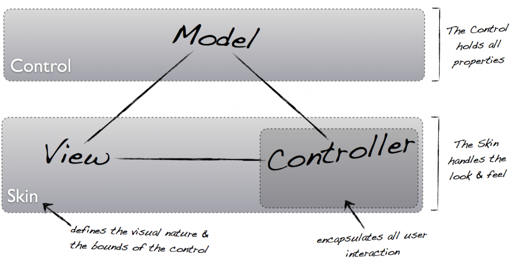
JavaFX Controls MVC Pattern

Like was mentioned there is still some aspects of Skinning that are not yet public API and that is the Behavior class, however, with the current state of things, you can already do a lot.

Since Java8 is not in G.A. status (full finished version) yet, there is still a considerable lack of documentation regarding the API, which brings me to my latest post on JMetro, at that time I was mistakenly under the impression that you had to extend a control in order to change its reference to the skin class, that’s why I created the ErasableTextField. However, as I later learned, you can change the skin class of a control just through CSS, like this:

.text-field{
    -fx-skin: "jfxtras.styles.jmetro8.MetroTextFieldSkin";
}

The “text-field” style class is assigned to TextField, so when the “-fx-skin” CSS property value is changed the reference to the skin class that is to be used with this control changes. So the ErasableTextField class is no longer necessary and has been removed from JMetro.

I find this design very interesting! As you can see the Skins are completely decoupled from the controls, all you have to do is assign a stylesheet to a scene without touching any of the code in your app and the look and feel of your application can change radically – like for instance JMetro Textfield skin adds a clear button that shows up whenever there is text inside:

jmetro-textbox

JMetro adds a clear button to TextField