As promised, the just released Java, JavaFX theme JMetro version 4.6 brings a new style for the Progress Bar.
The Progress Bar has two possible states: determinate and indeterminate and the new JMetro version has different styles for these two. In this post I’ll also go into a few details about some API design principles I abide by in JMetro.
JMetro API design principles
I have a few principles regarding the API of JMetro. One of them is that it should require a minimum setup and have a minimum required API. This means that, for instance, with only a few method calls you can have JMetro applied as the theme. Right now, only these two line of code are required (that can easily be collapsed into one):
JMetro jMetro = new JMetro(Style.LIGHT);
jMetro.applyTheme(root);
It also means that I try not to introduce new controls, except when they should absolutely be introduced. For example, with the new Text Field and Password Field style I could have introduced new controls, since both of these controls add new features like the clear and show password buttons. Instead, I’ve opted to add these new features by introducing new skin classes that you can use in the original controls.
This approach has two advantages:
- The developer can easily change themes. From JMetro to a different theme and vice-versa. Since JMetro only introduces new controls when strictly necessary there is no strong coupling with JMetro. For instance you might decide to use a different theme when on mobile or on a different O.S. Or just simply you decide, you don’t want to use JMetro anymore. This is very easy with JMetro.
- A shallow learning curve. It should be really easy to start using JMetro. At the very minimum, all you need to know are two lines of code that configure and apply JMetro. Most of the controls are already in the JavaFX SDK. New skins are applied to these controls behind the scenes.
You can also configure most of the controls new looks through CSS properties, which allows you to keep using the same Java code as before (when you were not using JMetro). In the future I might add new API to also configure these features through code (e.g. Java code) but I still plan to keep the minimal required API.
Old JMetro Progress Bar
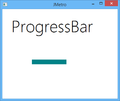
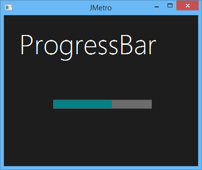
As usual I’d first like to show how the Progress Bar used to look like in the previous version:
This is a simple flat design style for the determinate state. There was no style for the indeterminate state in the older version.
New JMetro Progress Bar
Before continuing to show the new Progress Bar looks I’d like to explain why two possible states exist. When you can determine with some degree of certainty how much progress has been done in a particular task you’d use the determinate state. In this state you’ll show how much progress has been done. The amount of progress is determined by how “filled” the Progress Bar is. When the task is nearly done the Progress Bar will be “filled” or almost “filled”.
In contrast, when you can’t determine the amount of progress that has been done or, for some reason, you don’t want to calculate it, you’ll set the state to indeterminate. This won’t show how much progress has been done. But it will at the very minimum show that some computation is underway.
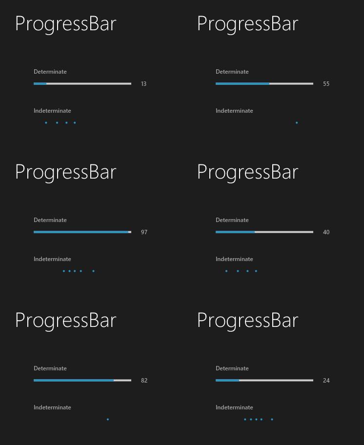
Inspired by Fluent Design, you can see the new styles for the Progress Bar below. Now the two states are represented by two new different appearances. Since my last post on twitter, I’ve tweaked the indeterminate animation a little bit.
The animation above might not look as smooth as in the live version. I didn’t have time to post a video instead of a GIF. That would possibly demonstrate the real result, better.
There is no difference between the dark and light versions.
Progress Bar details
I tried to make the CSS styling of the new Progress Bar as similar as possible to the original JavaFX Modena CSS. You’ll still find a “track” and a “bar” CSS style class, that you can style, just like in the Modena stylesheet. This was not possible for the indeterminate state, since the appearance is completely different.
For the indeterminate state every “dot” is a Region with style classes: dot and dot_<number>. <Number> is the position of the dot, starting from 1. You can style every “dot” however you want since each one is a Region.
For example, if you wanted the dots to progressively be darker you could add in the following CSS:
.progress-bar:indeterminate .dot_1 {
    -fx-background-color: ACCENT_COLOR;
}

.progress-bar:indeterminate .dot_2 {
    -fx-background-color: derive(ACCENT_COLOR, -15%);
}

.progress-bar:indeterminate .dot_3 {
    -fx-background-color: derive(ACCENT_COLOR, -30%);
}

.progress-bar:indeterminate .dot_4 {
    -fx-background-color: derive(ACCENT_COLOR, -45%);
}

.progress-bar:indeterminate .dot_5 {
    -fx-background-color: derive(ACCENT_COLOR, -60%);
}
ACCENT_COLOR is a JavaFX CSS variable defined in JMetro that specifies the accent color for the JMetro theme. derive(..), is a JavaFX CSS helper function that darkens or lightens the given color depending on whether the passed in percentage is negative or positive.
This example would give the following result:
Conclusion
A new style for the Progress Bar has been added, in JMetro version 4.6. In this post I also outlined some of the design principles behind JMetro.
Like before, you can check the JavaFX theme JMetro page for updated documentation (will be updated with this new version soon).
JMetro is quickly reaching version 5.0. All the most difficult controls I had planned to add till version 5 are done. In the next few releases I plan to clean up, re-tweak some styles and add the possibility to specify the accent color of controls. Possibly, I can also add a new control style, till then. Ahh.. and making JMetro available in Maven Central.
As usual follow me on twitter.


Greetings, After adding jmetro-11.6.9.jar to my NetBeans JavaFX project Libraries, and adding those two lines of code u mentioned above, the applyTheme(root) function is not known. it gives an error.
the dots progress indicator implementation can’t found here, can u plz share a guide/link on how to implement it? (JavaFX, Netbeans)
Hi Shukran,
I’m sure there’s something that’s escaping you.
Check the JMetro documentation: https://www.pixelduke.com/java-javafx-theme-jmetro/
I use JMetro with no problem (and other people) so there’s probably something you’re missing.
Thanks, kind regards,