Another version of JMetro has just been released. This time version 5.3. With this version a few new styles were added for controls that didn’t have them yet. Also some older styles were tweaked and some bugs were fixed.
I’ll also show some of the big companies that are using JMetro. Names like Google, Amazon, etc.
Here are the styles that were added:
- Tree Table View
- Menu Button
- Hyperlink
Next, I’ll go into more detail about this version.
JMetro version 5.3 details
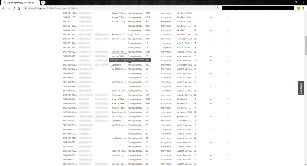
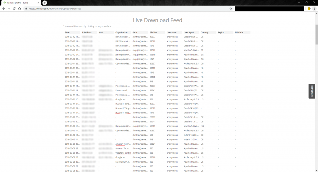
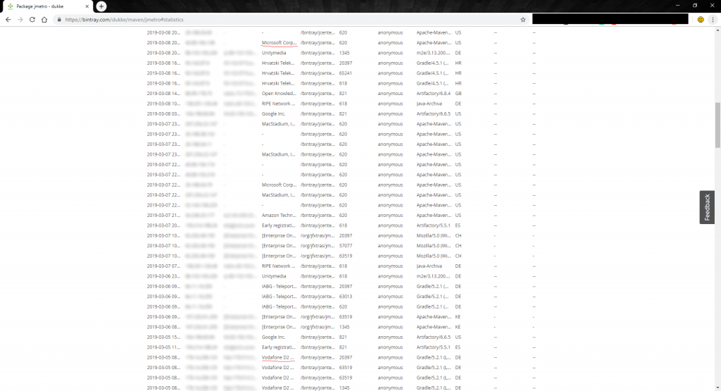
Last week, out of curiosity, I checked out Bintray live stats. It was something I had never looked at and I was curious to know who was using JMetro. Basically this feature of Bintray lets you know the organizations that have downloaded your library in the recent past.
To my astonishment, names like Microsoft, Amazon, Google, Huawei, Vodafone popped out ?. And these were just the most recent logs.
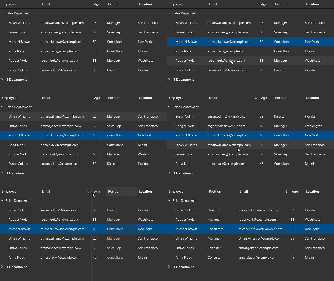
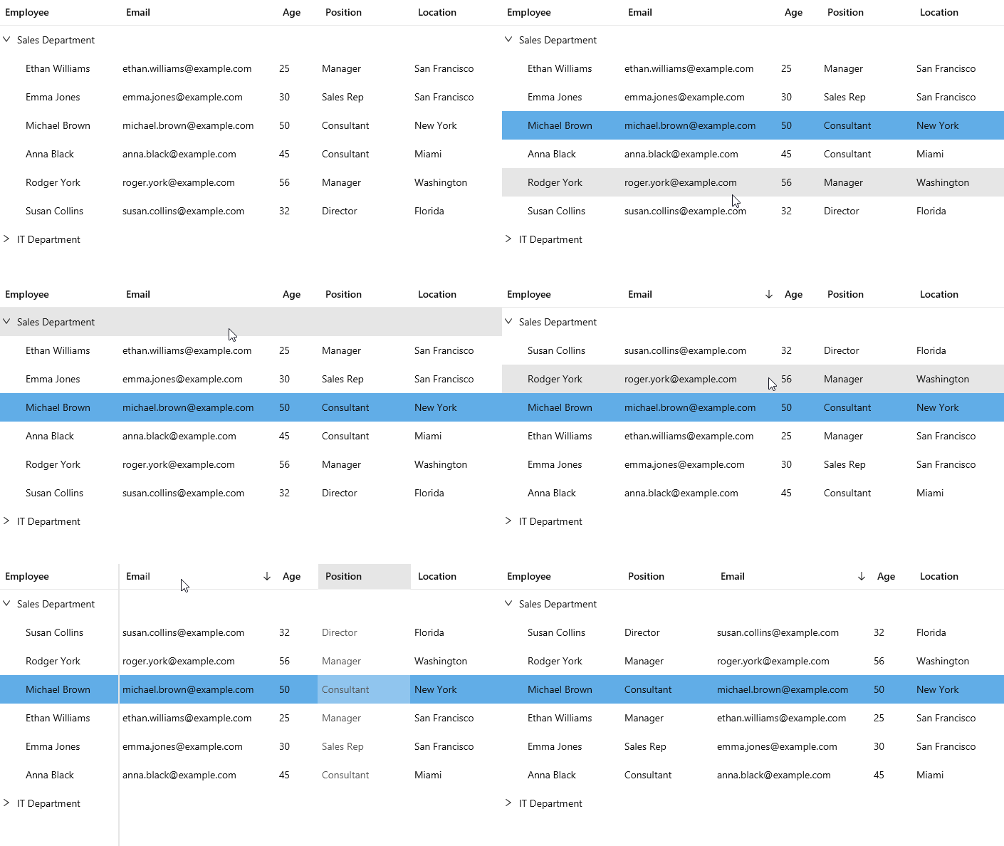
New Tree Table View style
Following are images of the new Tree Table View dark and light style. These are also styles that aren’t yet defined in Fluent Design. They have been made to be in harmony with the rest of the Fluent Design inspired control styles.
First the default Modena JavaFX style:
And now JMetro dark and light styles:
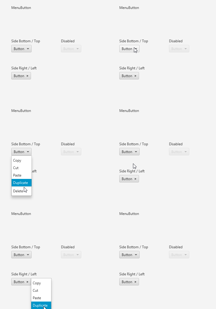
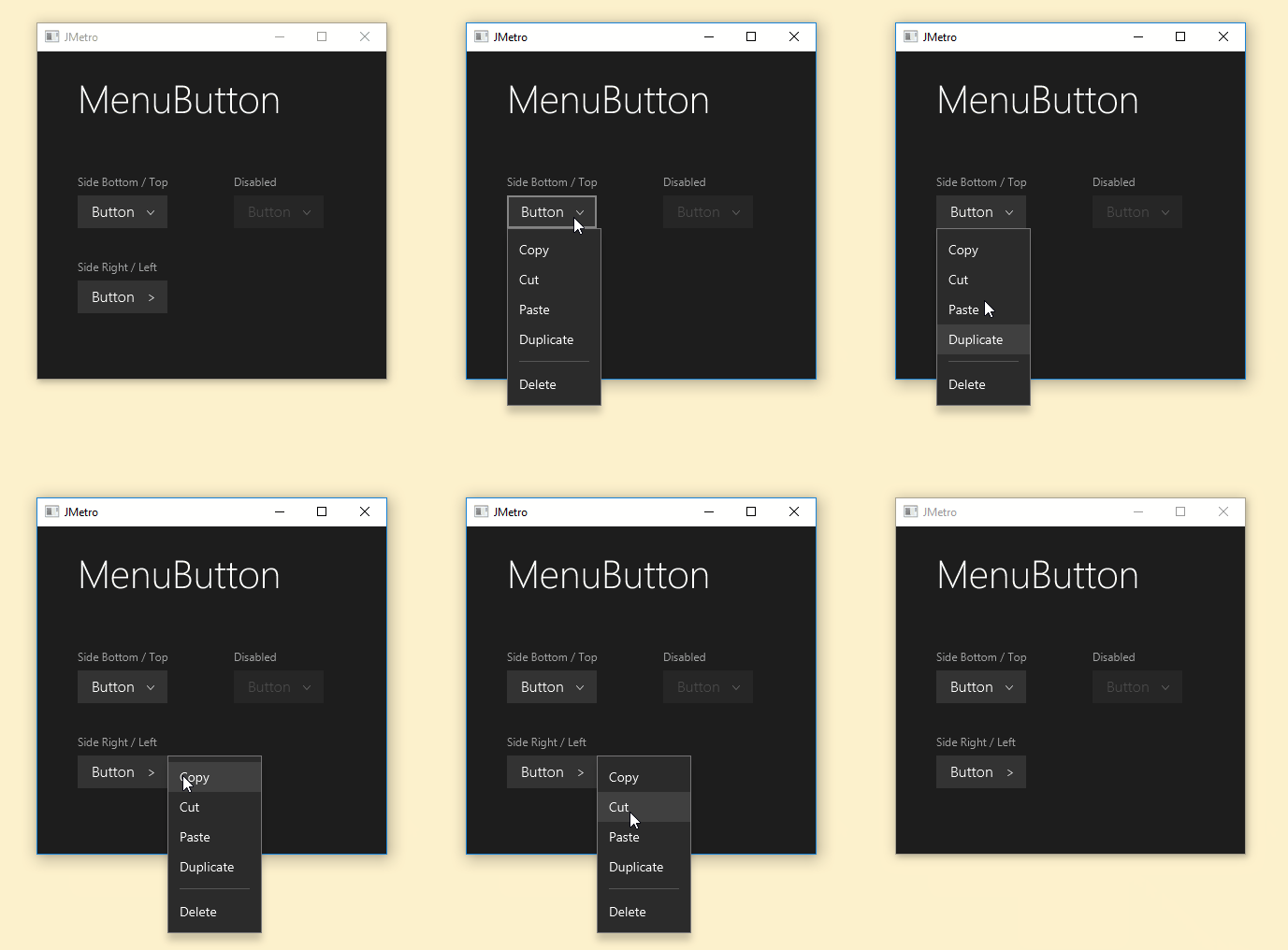
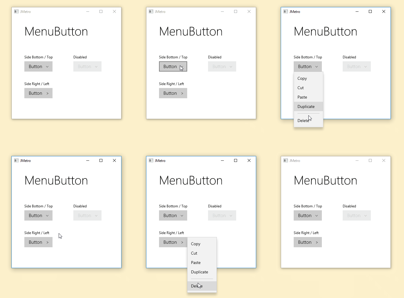
New Menu Button Style
The MenuButton now also has a JMetro style. First the default Modena style:
And the new JMetro styles:
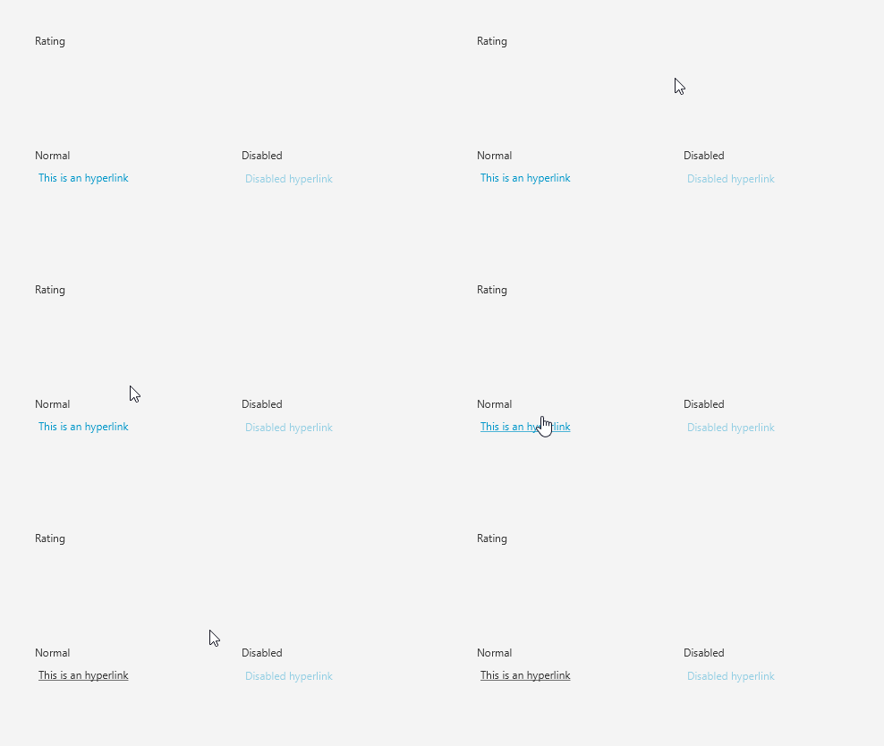
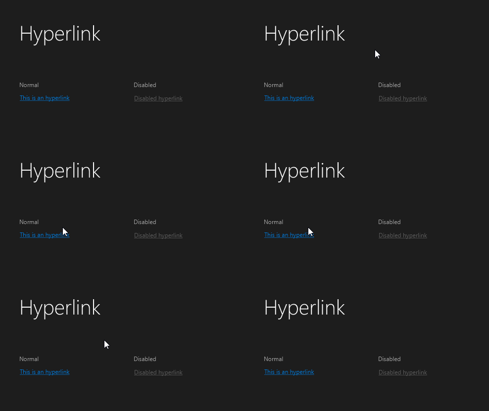
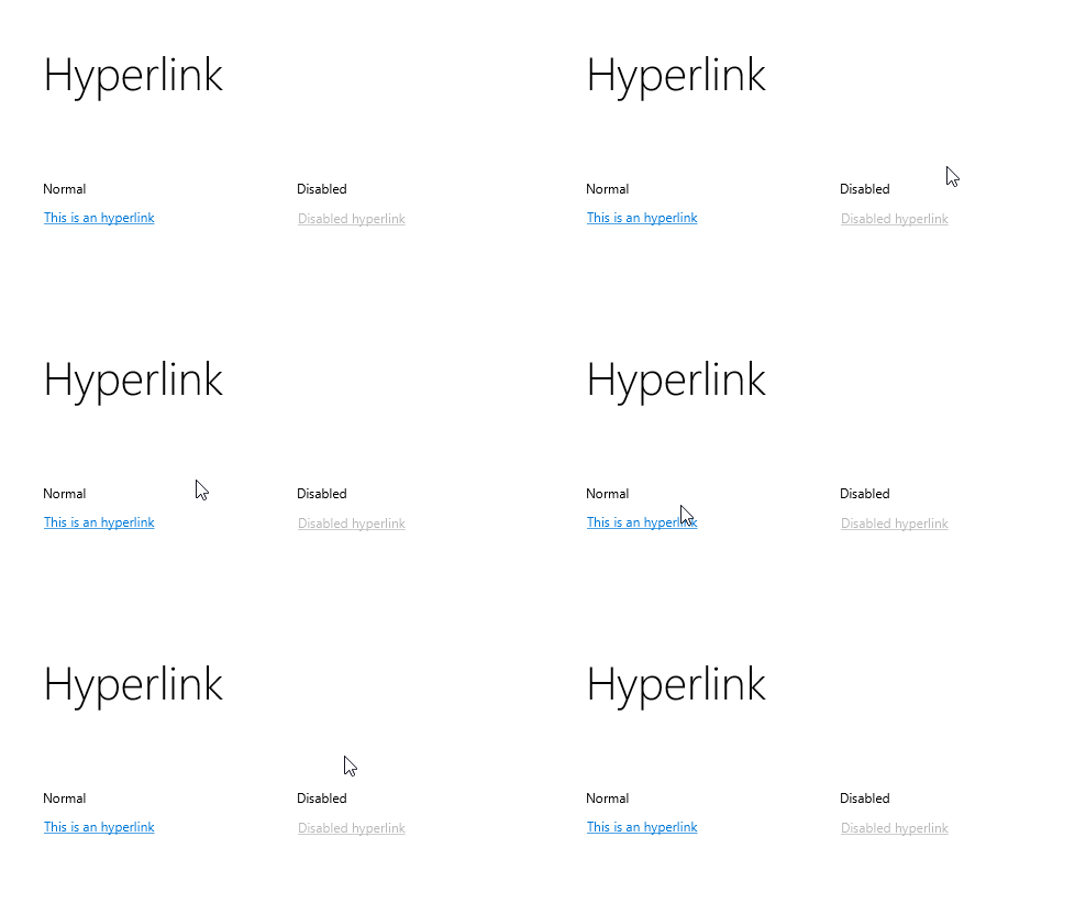
New Hyperlink Style
New styles for hyperlinks have also been added.
The default Modena style, doesn’t show the hyperlink as underline when the mouse isn’t hover it (only if has already been clicked). I believe hyperlinks should always be underlined as users have grown accustomed to underlined, colored text, signifying it’s a hyperlink button.
First the default Modena style:
And the JavaFX dark and light JMetro styles:
Other improvements
Here’s a couple other improvements:
- Fixed progress bar track color when using dark theme
- Added workaround for TornadoFX bug where it doesn’t load stylesheets specified with
@importstatement.
Wrapping up
And another release of JMetro is out the door. As usual, a lot of attention to detail was put into styling the controls because, I believe, attention to detail can be distinguishing factor in a user interface.
For this release I’d like to thank Pavel Erokhin (MairwunNx – check out his projects) again, he’s done a good work helping out with this release.
Coming next, a few enhancements are already on the pipeline, so keep checking me on twitter and this blog.
Have a great week ?.

Looks great!
Thanks Saied! 🙂
Yes! Great post! Good job! :), thanks for mention!
I continue work when Hackaton done (29 march), so sorry for low activity for past 2 – 3 days 🙂
No worries Pavel. Have a great Hackaton!
Thanks for helping to make JMetro even better. ?
Thanks for this post…:)