Hi, version 5.6 of JMetro has just came out and this post will highlighted the major changes.
This release was mostly about perfecting and tweaking styles that already existed in JMetro with a couple addition of styles that didn’t exist.
Keep on reading to get the details.
Changes to Controls which use cells
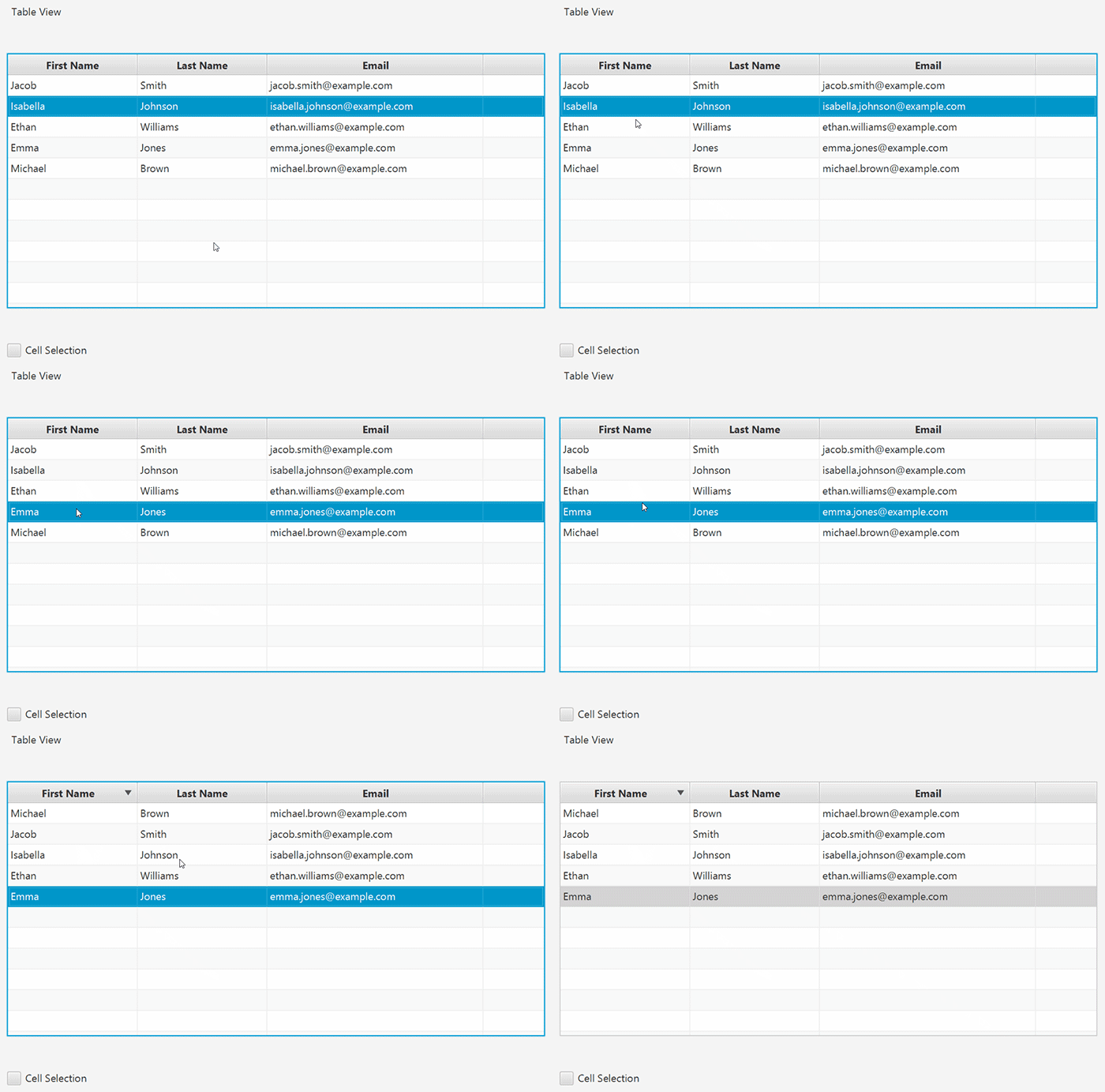
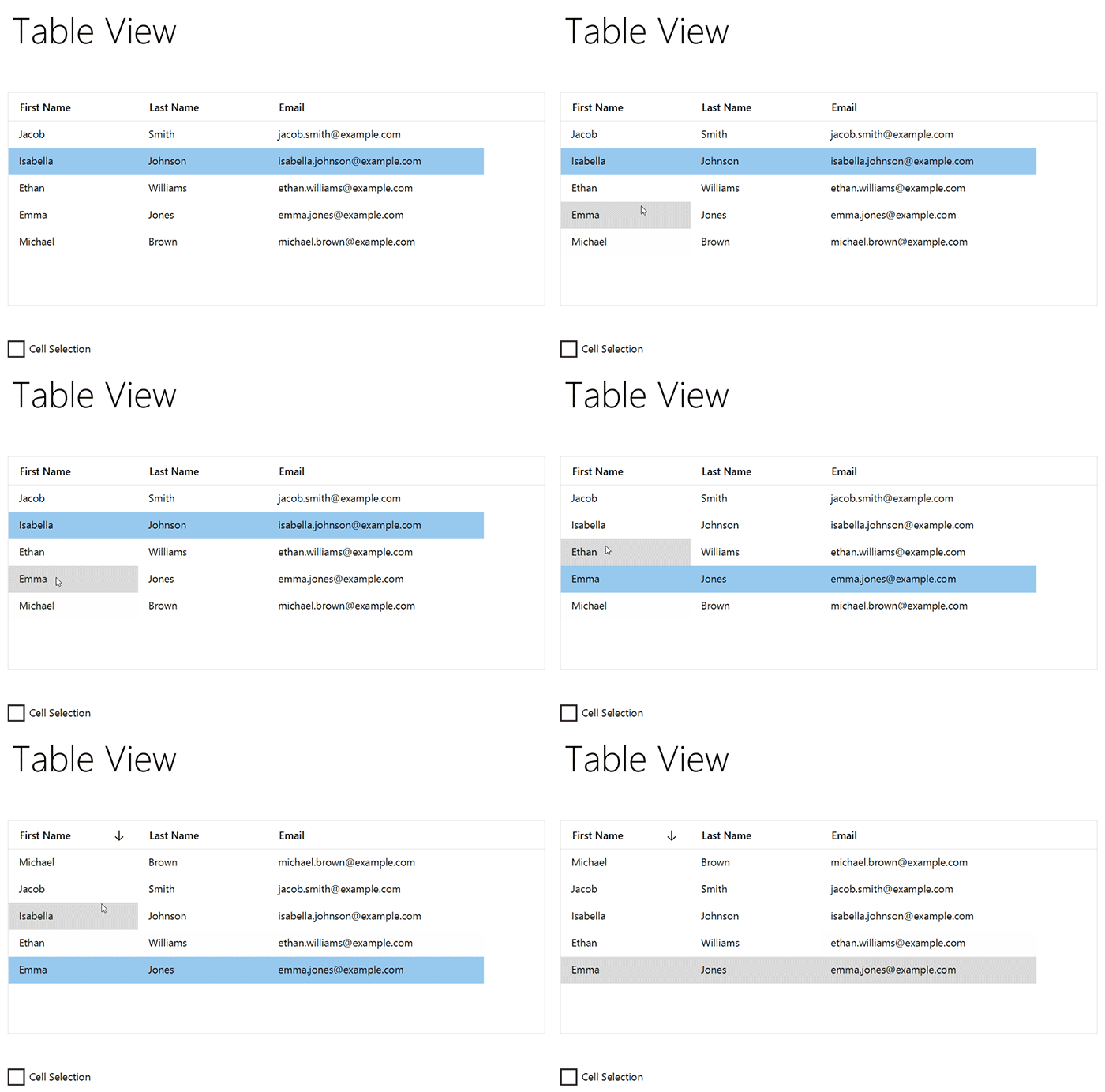
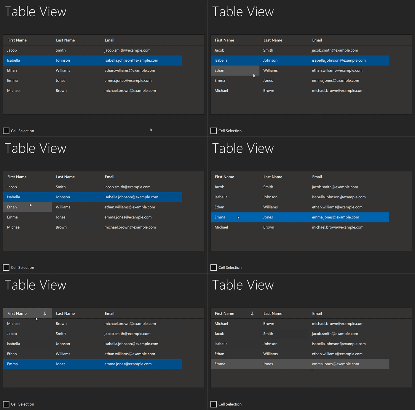
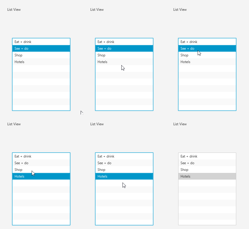
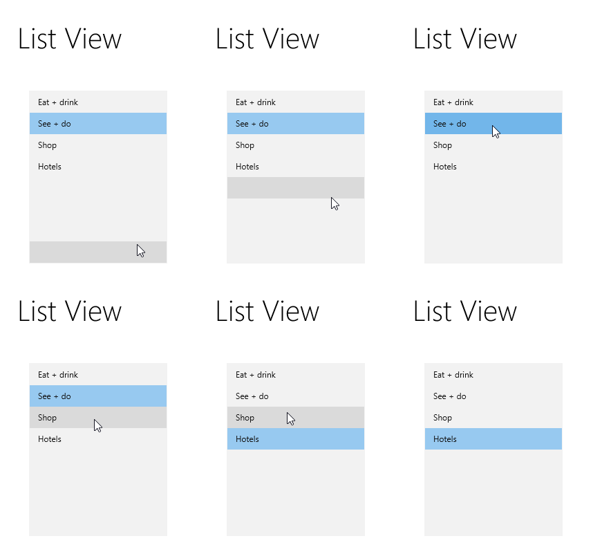
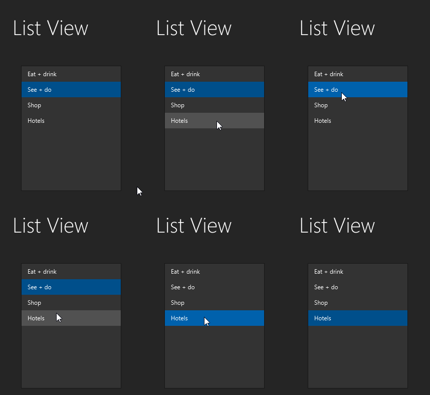
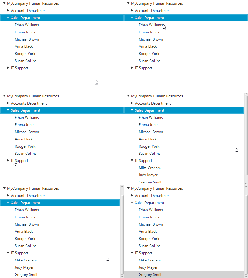
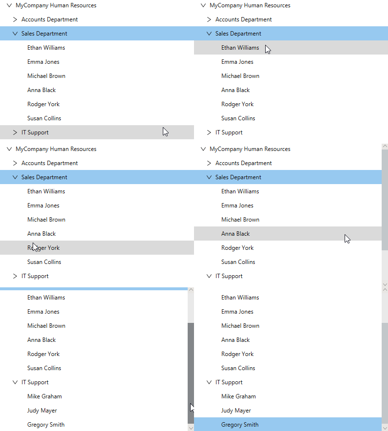
Cell based controls like TableView, ListView, TreeView, TreeTableView have been updated, these styles have been tweaked to make sure all of these controls have consistent styles among them.
TableView and TreeTableView style haven’t been defined in Microsoft Fluent Design, although there is a community version of a table control. JMetro TableView and TreeTableView styles differ from this control.
Looking at the Modena (JavaFX default) themed controls you can still see some skeuomorphic aspects which have generally fallen out of fashion these days, since about the year 2010 when Microsoft first started using a flat design (with Metro) and then Apple and Google. Modena was released at about slightly before this time of transition.
There’s also no hover effects when the mouse hovers over the cells. You can see all these differences in the following animated images.
TableView
Default JavaFX style
New JMetro style
ListView
Default JavaFX style
New JMetro style
TreeView
Default JavaFX style
New JMetro style
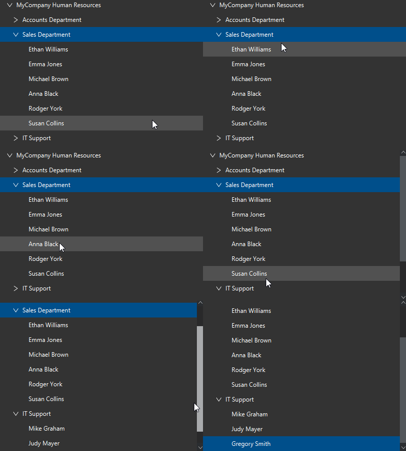
For the TreeTableView style you can refer to this post: https://pixelduke.com/2019/03/25/jmetro-version-5-3-released/
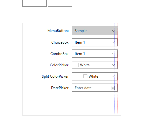
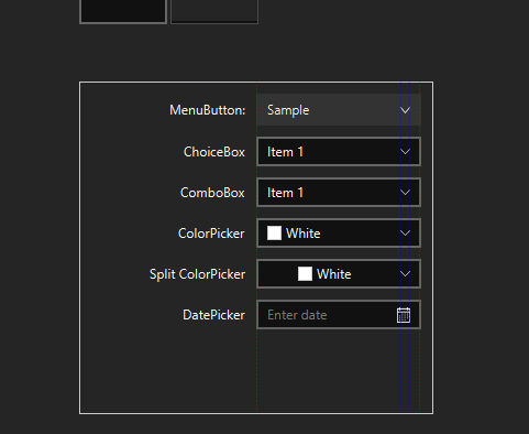
Controls that use arrow buttons
Controls that use arrow buttons have been tweaked to ensure consistency. Consistency of arrow size, alignment and color. Following are some screenshots of these controls in the alignment test from the ThemeTester app available in the samples.
Other Changes
Other changes to JMetro:
- A new style for the Separator control has been added
- Button’s padding have been made smaller to be more inline with the default size of buttons on Modena
- Change combobox popup text size to be inline with the rest
- And some other small details
Wrapping Up
That’s it for this update. Styles for controls that use cells and controls that have a arrow button have been updated. A new Separator style has been added and some other changes. One of the focus of this update was to improve consistency among controls and tweak already existing styles.
Probably, next up:
- Editable Combobox style
- Split Button style
- SplitPane
- Possibly update Spinner style
- Other changes
Stay tuned. Cya on my next post or on twitter.